Monday 7 May 2012

Experimental Typography - Planning

I've summed up some thumbnail designs of the architecture magazine,  "Arkitect". I first designed some thumbnails for the front cover of the magazine. Afterwards I created the final design for the cover. When doing so I can then make the double page spreads which will blend well with the front cover.


Next, I created the final double page spread designs for the Architecture News and the Architecture Review.


Monday 12 December 2011

Typography - Designing the zine using InDesign

After drawing up some designs onto our sketchbooks, we had to create our personal zine via InDesign. This included a front page and a double page spread, each page being in A4 size. I've been experimenting with typefaces and colours and came up with a couple of zine designs. This is the one I was least happy with.


It seemed too dull for attracting teenagers but it did look pretty professional. The text size in my opinion is possibly a bit too big and maybe needed more colour.

I have then created another copy with a different layout and style with a front page included. This will be my final piece.


Typography - Designing the zine using InDesign

I was set a task which was to create a 2 page A4 zine about anything on the Black Country and to make sure it appeals to teenagers. I chose to make a zine about Wolverhampton Wanderers Football Club and their history etcetera. I've completed the thumbnails on my sketchbook and decided to make some of those designs on InDesign.

By practicing on layouts, colours and text, we were given a draft called "Hello and Welcome" and had to edit the features of the document into something more interesting and with more character. This is my ending result...


I am really happy with the way it's turned out. It looks professional and may appeal to the same age audience as myself.

Monday 28 November 2011

Illustration - Amnesty International

I've been asked to complete a task in which I have to design an A3 coloured poster supporting Amnesty International.
They support many charities including ones that help sufferers in domestic abuse, which is what I chose to do. I some research into some of the artists relating to the problem, such as Guerrilla Girls and Barbara Krugar which have both inspired me with some of my sketches and my final piece.

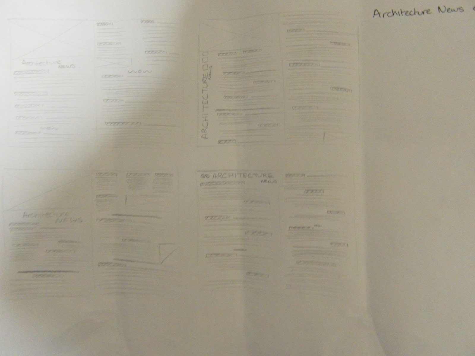
Here's a few of my sketches


And my final piece in colour. (I spent a lot of time on the anatomy and the proportions of the face). This was done in a CAD program called Paint Tool Sai and edited more on Photoshop CS4 -

Tuesday 22 November 2011

Review on Breathless


I really enjoyed this film because I like how Michel and Patricia developed a loving relationship slowly as the film goes on. Michel at first seems to be a cocky character running away from the police continuosly. With Patricia, it was an odd relationship as she was stubborn to help him and to actually be close with him because he was on the run with the police. She does eventually help him but it truly shocked me near the end where she had betrayed him so that the police could capture him.

At first it was hard to understand, but as the film continued, you seem to get a grasp on what's going on, mostly between Michel and Patricia as that gave us a confusing perspective on them. I do love the artistic and misty feel in the film and I love how the relationship between Michel and Patricia developed in an unusual way. I found it quite romantic and would definitely recommend this film.

Saturday 5 November 2011

Hello!

And welcome to my blog! This is somewhat a starting portfolio featuring all of my best artistic works to show off to you all. So please keep your eyes peeled! I will start adding things in sometime this week! Thanks for visiting <3